Brrrrr! Global Warming!

"Winter has come early to New Zealand this year delighting skiers and snowboarders, and lifting the spirits of the tourist industry with the promise of a bumper season ahead.
With unseasonably early, heavy snow falls throughout both islands -earliest in decades for some regions - the country's main ski fields are opening with an already greater number of bookings than last year."
Government Tourism Site, 2009
More Alteration Of Weather Data: New Zealand
It was a curiosity this last July when NASA and the Climate Research Unit, among other proclaimed July 2009 as one of the hottest of the last 2,000 years. In many parts of the world, it was unseasonably cold. In fact over 3,000 'coldest' records were set (Google it).
South America had its second coldest July (Reported inexplicably in USA Today as the warmest July. Guess they missed the snow storms in Buenos Aires), Australia had a number of cold extremes , and cold records were set throughout the Midwest and Southern United States.
But who are you going to believe? Your lying eyes watching the cold rain blow over, or the aforementioned, thoroughly discredited data manipulators, conspirators, and agenda driven cranks? Hmmmm.
Now we have another agency to add to the list of hoaxsters attempting to falsify weather data to prove Anthropogenic Global Warming. That would be New Zealand’s National Institute of Water and Atmospheric Research (NIWA).
NIWA has been caught in the most basic form of data manipulation: it simply lies. This was the time honored technique honed by James Hansen at NASA. Hansen has, over the years, removed from the historical weather record various thermometer measures of temperature. For inexplicable reasons, actual measurement of temperature was determined to be less reliable than climate models and estimations using proxies.
So goes NIWA.
As reported in ICECAP (Are we feeling warmer yet?), a study by the New Zealand Climate Science Coalition shows the same pattern.
Below is the NIWA graph of New Zealand temperatures from 1850, more or less, onwards. Note that thermometer readings became more common, rather quickly, through the 19th Century. So early readings (2 stations) could be balanced sometime after 1860 or so with multiple readings from various cities and towns (7 stations). These temperature records exist and are kept by NIWA. So here is New Zealand's historical temperatures, depicted in the NIWA graph.

[ABOVE: "The blue and red bars show annual differences from the 1971 - 2000 average, the solid black line is a smoothed time series, and the dotted [straight] line is the linear trend over 1909 to 2008 (0.92C/100 years)."]
...
"This graph is the centrepiece of NIWA’s temperature claims. It contributes to global temperature statistics and the IPCC reports. It is partly why our government is insisting on introducing an ETS scheme and participating in the climate conference in Copenhagen. But it’s an illusion.
Dr Jim Salinger (who no longer works for NIWA) started this graph in the 1980s when he was at CRU (Climate Research Unit at the University of East Anglia, UK) and it has been updated with the most recent data. It’s published on NIWA’s website and in their climate-related publications."
So those are the averages of those thermometer readings right? You can clearly discern a long term warming trend commencing in 1900. In fact the trend is so severe that many longtime inhabitants of New Zealand should remember prolonged winters, snow storms and similar weather because it was clearly really a lot colder in say,1917 and 1918, than the 1971-2000 norm.
But the New Zealand Science Climate Coalition members could not remember those horrific winters so they decided to take a look at the actual temperatures, also at NIWA, and also graphed using the same norm.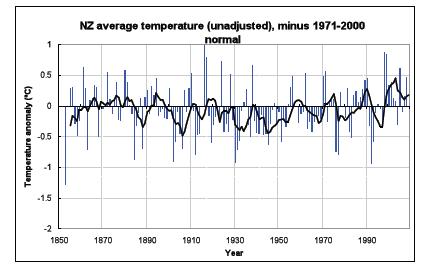
[ABOVE: "Straight away you can see there’s no slope - either up or down. The temperatures are remarkably constant way back to the 1850s. Of course, the temperature still varies from year to year, but the trend stays level - statistically insignificant at 0.06C per century since 1850. Putting these two graphs side by side, you can see huge differences.]
What is going on?
Why does NIWA’s graph show strong warming, but graphing their own raw data looks completely different? Their graph shows warming, but the actual temperature readings show none whatsoever! Have the readings in the official NIWA graph been adjusted?"
Of course! Because that is what climate scientists do.
The shocking truth is that the oldest readings have been cranked way down and later readings artificially lifted to give a false impression of warming, as documented below. There is nothing in the station histories to warrant these adjustments and to date Dr Salinger and NIWA have not revealed why they did this."
Now that is a laugh.
by Pat
Primary source: http://icecap.us/images/uploads/global_warming_nz_pdf.pdf
images:
* http://www.25ontheterrace.com
* http://icecap.us/